
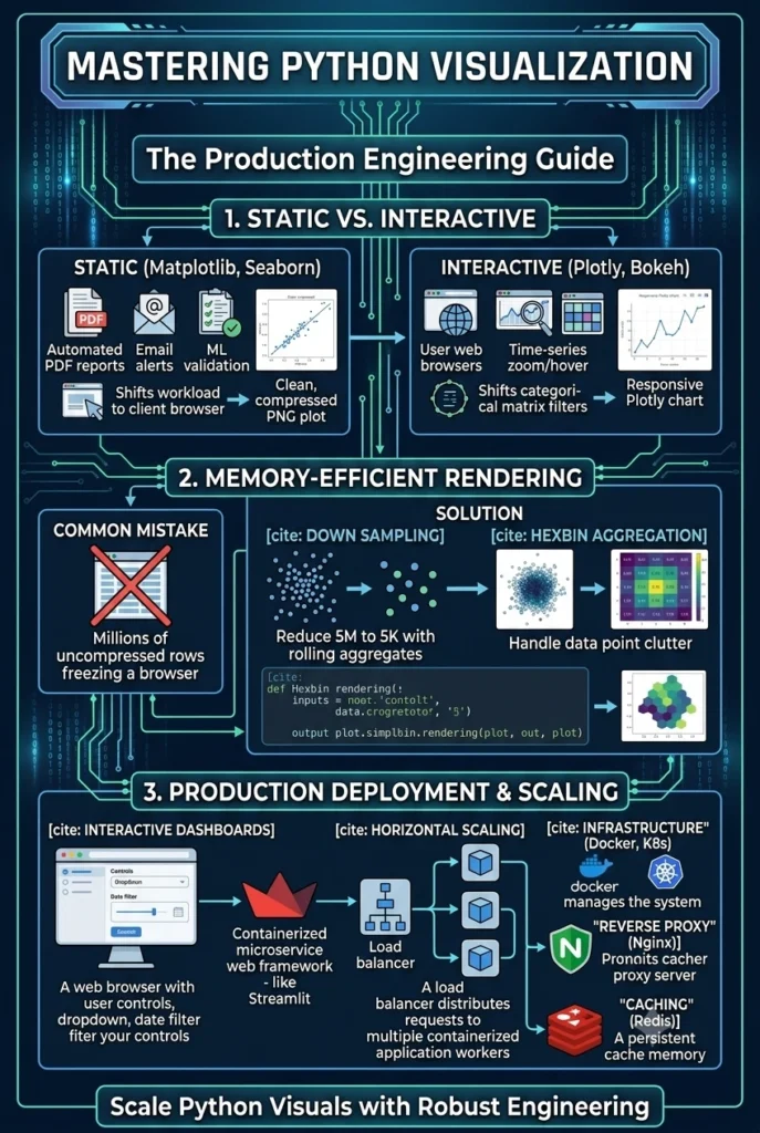
Generating raw plots in a local interactive notebook is simple, but scaling those graphics into production-grade systems is an entirely different technical challenge. In an enterprise workspace, python visualization is not just about aesthetics—it is a critical data engineering layer responsible for rendering clear business insights, identifying model anomalies, and serving high-throughput data streams to consumer-facing applications.
To build reliable, automated visuals, engineers must move past default plotting configurations. Production-ready pipelines require a deep, architectural understanding of rendering backends, memory-efficient data structures, and dashboard deployment frameworks. This comprehensive guide breaks down the structural design patterns, memory optimizations, and caching strategies needed to implement professional python visualization pipelines across your modern data stack.
The Visualization Pipeline Lifecycle
┌──────────────────────┐      ┌──────────────────────┐      ┌──────────────────────┐
│  1. Ingest Data      │ ───► │ 2. Vectorized Format │ ───► │ 3. Render Engine     │
│  (SQL/Data Stream)   │      │  (Pandas/NumPy)      │      │  (Static/Interactive)│
└──────────────────────┘      └──────────────────────┘      └──────────────────────┘
1. Choosing the Right Plotting Layer: Static vs. Interactive
A robust python visualization system matches its rendering tool to the production environment’s strict hardware and resource constraints. Selecting the wrong library tier for your specific system architecture can lead to memory leaks, slow page loads, or excessive cloud computation costs.
Static Graphing Frameworks (Matplotlib & Seaborn)
For automated PDF reports, background batch jobs, asynchronous email alerts, or machine learning validation logs, static rendering engines are highly efficient. They compile data directly into lightweight, flat compressed image formats like PNG or SVG, using very little server RAM.
Because static plots are pre-rendered on the server side and do not contain complex, client-side scripting layers, they load instantly when delivered over standard web networks. This makes them ideal for automated analytical pipelines where real-time user exploration isn’t required.
Interactive Web Engines (Plotly & Bokeh)
If your end-users need to zoom dynamically into time-series timelines, hover over data cluster coordinates to read metadata, or filter categorical matrices on the fly, you need an interactive framework. These modern libraries render graphics using JavaScript open-source modules packaged cleanly within an HTML wrapper.
[Server Data Payload] ──► [Encapsulated JSON/HTML] ──► [Client Browser Executes JavaScript]
By leveraging this design pattern, you shift the interactive computation workload safely away from your central server and straight onto the user’s local web browser, preserving your cloud infrastructure resources under multi-user traffic.
2. Memory-Efficient Rendering for Large Datasets
A common and critical error in production-level python visualization is passing millions of uncompressed rows directly into a browser-based plotting engine. Trying to draw millions of distinct HTML elements simultaneously will flood the client’s memory allotment and freeze the user’s web browser instantly.
To guarantee high availability and stability, you must integrate mathematical and data-handling optimization steps directly into your data manipulation logic:
Systematic Data Downsampling
Instead of displaying every single record in an enterprise database, apply downsampling algorithms or rolling aggregates to reduce rows before plotting. Showing five thousand carefully sampled, statistically representative points tells the exact same visual story as drawing five million raw points, without the devastating rendering performance hit.
Density-Based Hexbin Aggregations
For dense scatter plots where overlapping markers create immense visual clutter, use hexbin aggregations to group individual data coordinates into unified, color-coded numerical grids.
import matplotlib.pyplot as plt
import numpy as np

# Simulating a dense 1,000,000 point production data array
x = np.random.normal(size=1000000)
y = np.random.normal(size=1000000)

# Efficient high-speed hexbin rendering bypassing single-node bottlenecks
plt.hexbin(x, y, gridsize=50, cmap='Purples')
plt.colorbar(label='Data Point Density Count')
plt.show()
By substituting raw individual points for localized density bins, your rendering engine processes the graphic in a fraction of the time, maintaining clear readability while keeping server usage low.
3. Optimizing the Graphical Backend & Render Architecture
Every major visualization library in Python acts as an abstraction layer over an underlying rendering backend. Matplotlib, for instance, splits its code into a user-facing layer (the Pyplot script) and a hardware-facing rendering engine (the backend).
Understanding this architecture is essential when transitioning code from local development environments to headless production servers:
Headless vs. Interactive Backends
When running scripts locally, Python defaults to an interactive backend (like TkAgg or QtAgg) to open an active desktop window. If this same script runs inside an automated background docker container without a display monitor, it will crash with a fatal runtime error.
To avoid this bottleneck, force your production code to use a non-interactive, headless backend like Agg (Anti-Grain Geometry). This renders graphics directly into a raw memory buffer without requesting system display privileges.
import matplotlib
# Force the system to use a headless background engine before importing pyplot
matplotlib.use('Agg')
import matplotlib.pyplot as plt
This simple configuration ensures your batch reporting jobs run reliably across headless cloud instances, automated kubernetes clusters, and serverless background execution threads.
4. Deploying Interactive Dashboards to Production
To successfully share your analytical plots with internal teams and external stakeholders, you must wrap your python visualization assets inside a lightweight, containerized microservice web framework.
Using frameworks like Streamlit or Dash, you can build intuitive interface controls—such as dropdown filters, sliding date-range selectors, and categorical search bars—that communicate directly with your backend Python logic.
[User Changes UI Web Filter] ──► [Triggers Fast Python Event] ──► [Updates Dynamic Plot Matrix]
This decoupled architecture allows your applications to update dynamically as users query different segments of the database, providing real-time data access without requiring complete page reloads.
5. Caching Strategies and Reverse Proxy Topologies
When multiple users access a production data dashboard simultaneously, running duplicate, heavy SQL queries and re-rendering identical chart components will quickly saturate your database connection limits. Implementing an aggressive caching strategy is mandatory for horizontal scaling.
Incoming Request ──► Check Cache (Redis/RAM) ──► [Found: Return Chart]
                                             ──► [Miss: Run SQL & Render]
Analytical Function Caching
Use built-in application caching tools to store the processed results of heavy data frame calculations in memory. If two distinct users request the same historical sales chart for the year 2025, the application pulls the pre-built visual object instantly from cache memory rather than re-querying your data warehouse.
Edge Caching and Reverse Proxies
When deploying these analytical web apps, always position a high-performance reverse proxy server (such as Nginx) directly in front of your web application container. Nginx handles static asset delivery, manages transport layer security (SSL/TLS), and caches rendered HTML/JavaScript components.
This infrastructure layout shields your internal Python runtime from direct public hits, drop-safes your application against sudden traffic spikes, and ensures your data systems remain fast and stable under heavy concurrent loads.
Engineering Note: Mastering python visualization at scale means prioritizing data structures before presentation layers. Always use vectorized NumPy arrays or optimized Pandas dataframes to aggregate, clean, split, and filter your metrics locally before passing the resulting matrix into a final visual plotting layout.
If you are currently setting up your broader infrastructure architecture for live data tracking and production deployments, explore our comprehensive guide on building clean automation frameworks to fully optimize your operational data pipelines.
No responses yet